Friday, September 30, 2011

The Fruits of our Creative Labor


All life moves in cycles. Whether we notice the cycle of the seasons, where the earth transitions from growth to dormancy across the months, or the cycle within a day, as the sun rises and sets. Our lives are bound by cycles.

It is easy to forget this, as we look at the results of a cycle. In harvest time, we may see the results of the farmer's efforts in the piles of fruits and vegetables in the market, but we don't see all of the time and energy spent to get there. Preparing the soil, sowing the seeds, tending the growth, picking the fruit - all happen outside of our realm of vision. We only see the end result, the tomatoes sitting on the table, ready to eat.

Creativity is like this too. I am revisiting my concept of the Spiral of Creativity lately. I have had to remind myself that creativity is a cycle. I remind myself that creating something new and launching it into the world is not as easy as the end result would suggest. Shiny, delicious tomatoes don't just end up on tables without a lot of someone's time, spent in the dirt. That time in the dirt is when you "go dark" to the outside world. The time of the spiral where you are acting on and finishing an idea, doing something to make it real. No one else can see the effort you are putting in, to get things launched. They will only see the final result. It may look like nothing is going on for a while, as you create something new, even to you.

It is so much easier to be in the starting phases of the spiral, absorbing, processing and practicing. It's fun, and takes less time and energy to keep things moving. You can have multiple things going at once. My recent experience suggests it takes a lot less energy to jot down a few ideas about what you would like in a website, than to clearly articulate the details to a web designer. It takes less energy to sketch out layouts and envision them in your mind than it does to populate something real.

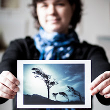
When a project is in the "finishing" phase of the spiral, there may not be much energy for anything else. All focus narrows to that one item that needs to be launched into the world. I was reminded of this fact on Tuesday, when I had no words to write here. I had images, lovely images, but no words would come. The creative energy I use for writing on my blog was being used in other ways.

For a short while I thought something was wrong, until I remembered how all things cycle, including creativity. Until I remembered the spiral and how I'm nearing the launching edge with my new website and new classes. At least this time in the spiral, I've been through the process before. The first time, as I was creating Find Your Eye, the final parts of the spiral were hard because I hadn't completed a full cycle before. Now I know how wonderful it is to launch something new and real into the world. All of the time and energy is worth it.

Whether it's vegetables or classes or websites or art, I'm reminded the Spiral of Creativity applies. You can't bring something new into the world without an expenditure of time and energy. You don't get those delicious tomatoes without some digging in the dirt.


_________________________

What's going on around Kat Eye Studio...

Thursday, September 29, 2011

Exploring with a Camera: The Color Wheel, Part 2


I found I could say things with color and shapes that I couldn't say any other way--things I had no words for. 
-- Georgia O'Keeffe

It's time to explore more color! This week in The Color Wheel, Part 2, we're looking at some of the more dynamic color schemes you can create using the color wheel. When you place colors that are not directly adjacent on the color wheel together in a composition, you get a fantastic burst of contrast and energy.

To review the concept of the color wheel* and the adjacent color harmonies, visit The Color Wheel, Part 1.

Let's dive right in to these new combinations!

Complementary

When you combine colors that are directly opposite on the color wheel, you have a complementary color scheme. This includes the primary-secondary complementaries (Blue with Orange, Red with Green or Yellow with Violet) as well as the tertiary complementaries (i.e., Green-Yellow with Red-Violet).  This color scheme has a lot of visual contrast, and can serve to pull your eye directly to a point in a photo by a pop of complementary color.


The lead in photo of the post, the purple and yellow painted wall I found in Hood River, Oregon last weekend, is an example of a complementary color scheme. Where does your eye go first? Mine goes to the yellow among the purple, then moves through the image to take in the other line and form.  The image below, captured in colorful Burano, is another example. The complementary blue is what draws your eye, out of the expanse of orange.


Here's an opposite... the orange flowers draw your eye immediately in the mostly blue image. Again, this is from Burano, Italy, one of my favorite places to capture color. The people who live here know and use color to great effect! It makes me wonder if they have a class on it in school, or if it's just lore learn over time in their local culture.


The chromatic contrast from the opposites on the color wheel is one of the easiest ways to give your images a "pop" with color.

Triadic


You can create a color harmony with three colors equally spaced along the color wheel. This is called a triadic color scheme. The most typical would be the primary colors, Red-Yellow-Blue. Often seen is also Green-Orange-Violet (especially around Halloween, in the US). There are two tertiary color triads as well. These equally spaced colors on the wheel can create a wonderful balance.


Again in Burano, this primary triadic color scheme was found. The primary colors play nicely together, the image has both energy and balance.


Another primary triadic image is found in these boats in the marina of Rio Maggiore, Cinque Terre. The jumble of nautical equipment is harmonized by the primary color scheme.


Triadic Variation


When you use two of the three colors from a triad, you have a triadic variation. Think Red-Blue from the primary triad, or Green-Orange from the secondary triad. This color scheme is very common and I found many examples in my images.


A particular favorite of mine is Orange-Green. Just take a look at my blog colors! I love the dynamic contrast these two colors have with each other. I gain a lot of energy from this combination.


An example of a Red-Blue triadic variation is below. Do you see how the red draws your eye immediately, in the sea of blue? There is much to look at on the blue wall - pipes and peeling paint - but you see that after zooming in to the red in the blue.


Tetrad


When you combine four colors from the color wheel, either equally spaced as a square or unequally spaced as a rectangle, you have a tetrad harmony. A square tetrad incorporates two complementary pairs. Surprisingly, these color combinations are balanced and create a lot of depth in an image.


When reviewing color schemes to prepare for this post, I did not think I would have examples for this complex harmony. As I looked closer though, I found they are in my images to great effect. Consider this recent favorite from the Corvallis Farmer's market. It's a rectangular tetradic combination: Red, Violet, Green and Yellow (well, yellow-orange). No wonder it works so well! What seemed like a random jumble of color was actually a color harmony.


Here is another color combination I always thought a bit crazy, but I loved how it worked in the image. The Orange-Violet-Blue color scheme is three colors of a square tetrad. Nothing I would have noted at the time of capture, but it helps to understand why these colors work together. In the future I will be better able to see and use these complex schemes in my images.


Proportion of Color


As you get into more complex color schemes with 3 or more colors, it is important to discuss proportion of color. Typically, a pleasing color combination will have unequal amounts of each color. When working with three colors, there is the "gallon-quart-ounce" rule. In non-US language, think of it as 60-30-10. You want a "gallon" (60%) of your image to be the main color, "quart" (30%) to be the supporting color and "ounce" (10%) to be an accent color.

This colorful boat (again, from Burano) is a great example. Mainly blue, with red as a supporting color and just a pop of yellow. I couldn't have set up a better example if I had tried!


Take a look at the examples in this post with the idea of proportion in mind. Do you see the different proportions in each, and how proportion and color scheme work together with the composition of the image? Considering color along with other factors in your compositions can be a powerful tool for creating interesting images.

Summary


This week we've covered some of the more dynamic color schemes you can set up with the color wheel:
  • Complementary - Two colors, opposite on the color wheel.
  • Triadic - Three colors, equally spaced apart on the color wheel. Using only two of these three colors is a triadic variation.
  • Tetrad - Four colors, either equally spaced on the color wheel (square) or unequally but consistently spaced (rectangle).
  • Proportion - Unequal proportions of color are more pleasing to the eye. Think "gallon-quart-ounce" or 60-30-10 for the relative proportions of color in more complex color schemes.
Are you ready to try it on your own? Go through your archives and go out and look for these color schemes, see what you can find and then share it with us (link in below or share in the Flickr pool). You might even look back at what was linked in last time for Part 1, there were definitely some of these more complex color schemes found in the images shared last time. I'm looking forward to seeing what you find!


FYI - Links will be moderated. Please use a permalink, ensure that your linked image is on topic, and include a link back to this site in your post through the Exploring with a Camera button (available here) or a text link. Thanks!

*The basic color wheel image is by Eyoungsmc and is used here by creative commons license. All notations added to the color wheel image are mine.


Wednesday, September 28, 2011

From Peaceful to Dynamic

color wheel - analogous?  maybe?  :)
color wheel - analogous? maybe? by kianve

We have finished up our peaceful two weeks of color, with The Color Wheel, Part 1. The images in this post, shared by your fellow participants, are great examples of the color schemes we all studied. To me, these are beautiful and peaceful images. There is a simplicity to these colors.

Tomorrow we look at some more visually dynamic color schemes as I cover The Color Wheel, Part 2.

Things are quite busy this week, here in the Kat Eye Studio! My mom and brother are visiting from out-of-state, and work on the new website continues. The fall Find Your Eye series started class this week (love it!!) and registration for Digital Photography Basics has opened! So much good stuff, I can hardly contain my excitement to a few words in this small space. :)

So you all tomorrow, with a new Exploring with a Camera. More color awaits!

umbrella graphic
umbrella graphic by Juli JohnSt


Tuesday, September 27, 2011

Time


Time is the coin of your life. It is the only coin you have, and only you can determine how it will be spent. Be careful lest you let other people spend it for you. 
 ~Carl Sandburg

How will you spend your time today?


_________________________

What's going on around Kat Eye Studio...

Monday, September 26, 2011

Authentic Imagery


In my type of wandering photography, I have a general rule that I follow: Find the beauty in what already exists in the place. I look for scenes that are there, capturing them as they are presented to me. I see my job as the photographer as capturing the beauty without interference. My challenge is to frame the image so that you can see it too, without being distracted by whatever else may be going on around.

I wandered by this lovely display of flowers on Saturday in Hood River, Oregon. Tucked back behind a table along the sidewalk, the texture of this pot, the pop of color and the interesting contrast of the sea shells and succulent plants caught my eye. Much to my son's chagrin (Mom, can we go yet?),  I studied it for a while with my camera trying to find the best way to capture it. This early image is one of my favorites.

After playing with it for a while from different angles, I did something I normally don't do... I actually moved the pot slightly. I straightened it up and moved it back so I could get the purple flower along the blue of the wood. You know what? In viewing my images, the ones where the pot had been straightened fall flat. They've lost their "found" charm. Their authenticity.

Maybe it is just me, but I find that this is one of my values in photography and in life: Authenticity. I have had strong negative reactions in the past to images that I find inauthentic. Particularly fashion photography, where reality is not the goal. For each artist, there is a different view and a different goal. Each artist brings different values to what they create. My reactions are not saying any type of photography is "bad," but they help me to zero in on what I value.

I like to find the beauty in reality, with all of its imperfections. The beauty that exists in the everyday, tucked along the sidewalks of the towns we live in. The beauty that exists in the hearts of each and every one of us imperfect beings. It doesn't matter if we don't live up to our culture's narrow definition of beauty, as prescribed by the mass media. It only matters that we are ourselves, and that we are sharing ourselves authentically.

Oh, look, I've found myself hidden amongst my photography again. Funny how that always takes me by surprise.


Yes son, we can move on now.


_________________________

What's going on around The Kat Eye View of the World...

Sunday, September 25, 2011

Faking Macro


I am musing on macro over at Mortal Muses today, and thought I would share a bit here about how I "fake" macro. I don't have a macro lens to speak of, so I used my 50mm lens for these shots. The light was low, so to get the focus on the detail I needed to set up on a tripod, something I rarely do. At an aperture of f/4, exposures were 1/3s to 1/4s. For the shot below, shared on Mortal Muses, I got as close in as I could with the 50mm lens, which has a minimum focal distance of 1.5 ft (0.45m).


In post-processing, I had to crop in further to get the view above. It was a vertical image that I cropped horizontal, and about 50% of the original image is gone to zoom in further. (I'm having some computer problems at the moment, or I'd share the original image too!) Converting to black and white helped to make the image a bit more mysterious, and keep the focus on the light/dark contrast and the lines, which is what caught my eye to begin with.

What am I photographing here, you might ask? A decoration in my bedroom, next to the window. I was wandering about my house, looking for something that would be interesting as "macro." Who knew such interesting light and lines were lurking there, just waiting for my camera.


_________________________

What's going on around The Kat Eye View of the World...

Friday, September 23, 2011

Change is in the Air


The seasons are changing, can you feel it? We have a crispness in the air some mornings. The apples are arriving at the market. The leaves are still on the trees and the days feel like summer, but change is in the air. I can feel it.

Change is coming to this space too. I have a new website under development at the moment. Yay! I love this blogger space so much, it's been the site of my journey, but it's become too small for what I want to do. I realized a few months ago that I had no room to grow. Things have been getting crowded around here. As I added the Liberate Your Art postcard swap and Find Your Eye classes, I've maxed out the available space.

So in a short period of time, I'll be packing up the virtual boxes and moving to a new space where The Kat Eye View of the World and Kat Eye Studio will both reside. It is interesting how my virtual life is mirroring my physical life, with a big move. Just as it was time to move home from Italy, it's time to move from here. I can feel it. At least with this move, I won't have a garage full of stuff to deal with!

It is exciting to see my new site develop. It's seeing a vision coming to life. There will be space, and room to grow. Lots of light and color and beautiful images. I can't wait to share it with you!


_________________________

What's going on around The Kat Eye View of the World...

Thursday, September 22, 2011

Share Your View: The Color Wheel, Part 1

chromatic colors in buckets
chromatic colors in buckets by Deborah T
Example of Chromatic Gradation

Color, color everywhere. Are you having fun exploring The Color Wheel? I am! There have already been so many great examples shared. There is still time to link in (below) or share your images in the Flickr pool on monochromatic, analogous and chromatic gradation. Read the original post here if you're not sure what I'm talking about, and then join in!

A quick note: Today is the last day to register for the fall Find Your Eye: Journey series of classes. The guided journey leaves this Sunday, September 25. I will leave you today with a few words from some of the lovely course participants from the Find Your Eye: Journey of Recognition course that completed last week. Their words speak so much better than mine!
"Photography has become my art form. No longer do I just shoot lots of images at events or family gatherings just because I own a camera. The "why" of taking photos is changed. I do this for me."
            -- Deborah T. Read more about Deborah's experience in her full post here.
"I’ve learned about my own photography. Through these classes I’ve been able to identify which elements of photography appeal to me. For instance, the shapes and forms of nature intrigue me. I also look for fascinating small details. As a result of the eye exercises in the class I’ve realized how important it is to look for and use light in my photographs. I've learned not to be controlled by rules and by other photographer’s opinions and photographs. I’ve learned to follow my instincts and my heart."
            -- Cathy H. Read more about Cathy's experience in her full post here.
"A loner by nature, the greatest gift of our time together was my connection with my fellow travelers. They constantly challenged me; supported me; commiserated with my frustrations; celebrated my triumphs and “ah-ha” moments. They shared their wisdom, their questions, their yearnings. I learned from their struggles, their insights, their truths. Together we dug deep; we had breakthroughs and realizations. We made each other smile. And think."
            -- Brenda. Read more about Brenda's experience in her full post here.
"I'm feeling more confident in my photography! Confident to continue to take photos that I'm familiar with... more willing to have a go at shots of things that I find harder (and even consider a bit of editing)... and being more confident to share myself through my photos... Basically, I'm inspired to keep on taking photos!"
            -- Leanne. Read more about Leanne's experience in her full post here.
Outside Hollys
Outside Hollys by Dorian Susan
Example of Monochromatic

zinnias
Zinnias by gina g10
Example of Analogous


FYI - Links will be moderated. Please use a permalink, ensure that your linked image is on topic, and include a link back to this site in your post through the Exploring with a Camera button (available here) or a text link. Thanks!

Wednesday, September 21, 2011

A Bike and a Smile


I've been getting a lot of smiles on my bike ride to work lately. It's been odd, people see me coming and they smile at me. It took me a while to figure out what was going on. Why all the smiles? It turns out, they were smiling at me because I was smiling as I rode

You see, riding my Italian city bike makes me happy. It's not as cool-looking as this bike I found in Pavia early on in my time in Italy, with its stylish zebra basket liner, but my bike still makes me happy. With it's basket, fenders, chain cover, dropped bar and completely uncool kickstand it is a comfortable, functional bike. It is me.

I've had a lot of experience with bikes that were not me. You see, a long, long time ago I hated riding a bicycle. I taught myself to ride a bike at 8 years old. I never got that comfortable, like the other kids who had been riding since they were 5 and were jumping off curbs around the neighborhood. As a teen, I went to summer camp where one of the activities was cycling. They put everyone on 10-speeds, assuming we could ride them. I was nervous and scared on the 10-speed, all leaned over on a twitchy bike. I felt like I was going to crash, and eventually I did. So much for biking! 

And then... about a year after getting married, I mentioned I might like to try out mountain biking. The bikes looked more comfortable and it was the latest craze. My husband, an avid cyclist prior to our marriage, turned so fast into the parking lot of the bike shop it was almost illegal. Newly armed with biking gear I started to ride the trails with my husband and other friends from work. It was all guys, and I tried to become the cool biker chick. I tried to like mountain biking, I really did. But after a couple of years I decided that I just didn't get why people would want to ride on these skinny dirt trails that you can easily ride off of. I didn't get why people would want to ride on paths with obstacles like roots or rocks in the way intentionally. I made myself ride with the "must-have" clipless pedals for a year, to see if I would eventually like them. I hated them as much the day I took them off as the day I started with them. I forced myself to do all manner of things that didn't seem to fit for me, in order to "become" a mountain biker. I tried to fit in with the mountain biking crowd, my husband and the guys I worked with. For years, I tried. It never worked.

What I did discover though, is that I liked biking to work. I liked the routine of getting out there, twice a day. Clearing my mind by working my body. Both getting somewhere and getting some exercise. Riding an exercise bike, nowhere? Ugh. Riding a bicycle to get somewhere? Perfect! 

One of the things I loved in Italy and Europe is that bicycling is not only a "sport" but a way to get around. A bicycle is an acceptable form of transportation. You don't need snazzy gear and spandex to ride a bike. It opened my eyes to these bikes that were both comfortable and functional, with maybe a bit of style too.  I loved the look of the city bikes that were everywhere. I captured them with my camera but I think it was my heart speaking through the lens, reminding me this type of bicycling was for me. 

So, last summer I went out and found a city bike. It's an amazingly huge and heavy bike, no worries about the lightness of frame here. I sit upright on a comfy seat. The bike has fenders, a chain cover, front and back racks, lights that run on a wheel generator, a kick-stand, wheel lock and a bell. It has the requisite drop bar in the front for riding in a skirt (although I've only done it that one time). I added a basket to the front rack, for even more functionality. I think I'm going to add some flowers to the front of the basket, that would make me even happier.

I look strange riding here in the US, among the mountain bikes on the bike path. There are more and more "city bikes" around but they still aren't that common. My bike is giant and odd-looking. But I'm no longer trying to fit in, I'm just trying to fit me. Seeing as I'm smiling as I ride without even know it, I think I finally got it right. 


_________________________

What's going on around The Kat Eye View of the World...

Tuesday, September 20, 2011

A Postal Mystery


Here we have a row of one of my recent fascinations, newspaper boxes. Some empty and abandoned, others and in use. All in a neat row outside of our town's post office. I loved the light coming along the wall, pointing to the row of these colorful boxes.

An appropriate photo to go along with the news of today's postal mystery.  Let me set the stage...

The Liberate your Art postcard swap had just finished up, and I was contacted by my online friend Elizabeth, from Puerto Rico.

"Kat, I never received any postcards. Did you get mine?"

"I've sent out everything I received! I don't remember if I got yours or not. If you didn't get anything, I probably didn't receive your cards. I'm so sorry!"

An unsatisfying ending. Until...

Yesterday. The postcards she sent to me in July for the swap arrived in the mail yesterday. Over two months after she had sent them.

So I have 5 cheerful postcards that Elizabeth liberated into the world two months ago, now looking for a home! I would like to get some postcards back to Elizabeth too, so if you would like to send Elizabeth one of your postcards, I will send you one of hers. You don't have to have been a participant in the Liberate your Art postcard swap to do this. Email me kat [at] kateyestudio [dot] com with your interest and I will send you the details. The first five to respond are in!

One last participant. A postal mystery that will never be resolved. All I need is a few generous readers to help make Elizabeth's swap happen! Can you help?


_________________________

What's going on around The Kat Eye View of the World...
  • The current Exploring with a Camera theme is The Color Wheel: Part 1. Check out the post and join in the exploration.
  • Are you ready to find your own unique vision through photography? This is the last week to register for the fall series of the Find Your Eye e-course. Class starts Sunday, September 25! Visit here for more info.
  • You can subscribe to the Kat Eye News to stay up-to-date on all the happenings around here.

Monday, September 19, 2011

Peace Comes Unexpectedly


What does this picture make you think of? It makes me think of an ideal kind of day. The kind of day where sunshine comes through the window, and there is personal time to bask in it. Time to work on my creative projects on my schedule. Sit and read or journal if I feel like it. It brings me a sense of peace and calm, and happiness. I took this self-portrait last weekend to show the progress in my studio, because I'm so happy with how this space is turning out. (Visit here to see what the empty space looked like.)

I am drawn to this image today, maybe because of the appearance of peace. This was not how my weekend went at all, it was a "work" weekend. With a garage sale on Saturday, we finished up our personal process of elimination. We all feel so much lighter and freer with the sale completed, left over items donated, and our garage space cleared! On Sunday we spent the day cleaning out our camping trailer, in anticipation of going away for the weekend soon. After sitting for two years, there had been a few visitors in the form of mice and bugs that left their mark. It turned out to be in very good shape overall, and after a few hours of cleaning it was bright and shiny again. Now we can't wait to go camping!

While I had been steeling myself for this weekend of work, it actually turned out quite well. I feel better for what was accomplished, even if it wasn't my dream day in the studio or out with my camera. I guess this is a reminder for me that there is more than one way to bring peace into your life. Sometimes it is slowing down, and spending the day in the sunshine on creative pursuits. Other times, it is completing projects and eliminating the stress associated with them being "undone." There is a great sense of peace that comes along with accomplishing tasks that bring space and possibility into your life.

How did your weekend go? I hope you found peace through your weekend pursuits.


_________________________

What's going on around The Kat Eye View of the World...

Thursday, September 15, 2011

Why We Need Art


I was so excited last weekend, visiting the Saturday Market here in town. I found the first American image for my market/wheels series! Yay!

When I applied the standard "seventies" processing used in the series to the image, I got chills. I had this amazing realization. This series transcends place and time. All over the world, farmers are bringing their delicious wares to markets on wheels. They always have, they always will. I can go anywhere in the world, anywhere, and find images for this series. I could be in the middle of rural China or my little town of Corvallis and I will find a market. In the market, I guarantee I will find wheels. Within this commonality, I can see the differences too. The unique elements that tell the viewer where I am.

This is why we need art. Art is a way to equalize. Artists find connections, and commonalities. We speak in a language that transcends words. Anyone, anywhere in the world can identify with a piece of visual art. It can move us, bring us together in a way that nothing else can. 

And each of us, with our unique vision of the world, has something to offer that conversation. Whether it's with a camera or a paintbrush or pieces of glass. Each individual point of view adds depth and dimension to the world we live in. We share our differences, and in the process, find the similarities between us. Don't you think, if the everyone in the world participated in the conversation this way, the world would be a better place? I think so. I hope you're joining in too.

_________________________


What's going on around The Kat Eye View of the World...
  • Linking in to Paint Party Friday today, with these two works in progress started this week. I'm loving the colors! I'm picking up some new liquid acrylics in similar colors tomorrow at our new art supply store in town. (Check out the bottom of the page - I'm featured!!) I can't wait to play with the new colors, and see where they go next.
  • The current Exploring with a Camera theme is The Color Wheel: Part 1. Check out the post and join in the exploration. 
  • Do you want find your unique vision of the world through photography? Registration for the fall series of the Find Your Eye e-course is open! Visit here for more info.
  • You can subscribe to the Kat Eye News to stay up-to-date on all the happenings.

Exploring with a Camera: The Color Wheel, Part 1


**Please Note: Due to a technical difficulty the Exploring with a Camera button is no longer linking to the correct page. Please get the new button code at the bottom of this post, and replace your old button.**

I love color in photography. I love the energy and emotion you can convey through color. There is a peaceful beauty in black and white, but there is so much richness and depth in color! For the next month in Exploring with a Camera we are going to look at color. Using the color wheel as a guide, I'm going to take a look at how colors work together and how you can use that to create photographs with beauty and impact.

I was browsing a used bookstore with this topic in mind and came across the Color Workbook by Becky Koenig. What a great find! In the preface she writes:

Color is both a physical and an emotional human phenomenon. We respond to color because of its associations. We each have our personal preferences for particular color combinations. Our experience of the world is in some ways characterized by our observation of color: a green apple, a red sports car, the pink sky of a sunset, the blue of a robin's egg. These colors evoke not only an outward experience but also form colors in our memory, our inner eye. Color is not simply a decorative element in art, but a part of our inner consciousness. Color is life enhancing.
Yes! Color is life enhancing. How you see, use and portray color in your photographs is part of your eye. We may not understand why certain color combinations work to create the feel they do in our images, but there is a science and study of color that can help explain it. Let's start with the basic color wheel.*


The idea behind the color wheel is that color is a continuum. You start with the primary colors, Yellow, Red and Blue. These mix to form the secondary colors, Green, Orange and Violet (Purple). There is an intermediate color that comes from mixing a primary and secondary, noted by two letters such as "RV" for Red-Violet. These twelve colors, 3 primary, 3 secondary and 6 tertiary, form the basic color wheel. The remainder of the colors come from mixing these 12 in various ways or with neutral colors - black, white, brown. Using this as a base, we can explore the different color combinations.

Now, I don't anticipate that in our photography we are going to go around with a color wheel looking for color combinations before we take a photograph most of the time. Looking at the color wheel relative to our photographs or those of others can help us understand how and why certain color combinations works. It can help us identify what we use most often and respond to in our images. That study will inform our images at the time of capture in the future. We may be more in tune with color and how to use it the next time we go to shoot.

To start us off in Part 1 of this study today, we are a going to look at the simpler color schemes or "harmonies" as the Color Workbook calls them.

Monochromatic

The first color harmony is the simplest, monochromatic or one color. You may need to reset your definition of "monochromatic" a bit, because in photography "monochromatic" often refers to black and white or images with a single tone, like sepia. This type of image is certainly monochromatic, but let's look at monochromatic color.


I use the monochromatic color harmony a lot. It creates a unified and cohesive image. My favorite pink shutter and wall in Burano is a good example of a monochromatic color scheme. All shades of Red-Violet, with accents that are neutral in the shutter holder and the board behind the peeling paint.


Another favorite monochromatic image is this door handle and lock from Greece. You can see in both of these images how framing a small portion of a larger scene can lead to a monochromatic image.


Framing a small portion is not the only way to get a monochromatic image, however. Another favorite from Greece shows an image that is primarily monochromatic, with the blue door, sink and gas can. There is a tiny pop of red in the faucet, but the rest is neutral and the overall color impression you have in this image is "blue."


This monochromatic image, from Burano, is green. Again, it's not all green, but the image is primarily shades of green and the remainder is neutral.


Monochromatic color schemes are great in our photographs because they can unify multiple diverse elements, as in the example of the door and the chair above. Monochromatic schemes can also help to convey a third element, like texture, as seen in the shutter and door handle. Just remember - monochromatic doesn't mean only black and white. There is so much energy and emotion to be added to an image with color!

Analogous

Moving into a slightly more complex color harmony from the color wheel, when you take two or three neighboring colors on the wheel you have an analogous color scheme. Analogous color schemes always have at least one color in common. In the diagram below, the common color is orange.


I see analogous color schemes in my images a lot, mainly in the red-orange-yellow part of the color wheel. This window in Switzerland is a great example. The grey and green serve the purpose of neutral and we see mostly the yellow and orange of the pots and window frame.


Nature is the best at creating analogous color schemes! These flowers, found in the Nice flower market, are a good example. The flowers themselves, highlighted in that beautiful light, create a lovely analogous image.


Designers use color schemes in advertising all the time to catch our eye! The analogous red-orange found in this window display is a good example. The bright, unified color along with the shiny baubles really caught my eye.


You can see how much I use the yellow-orange-red part of the wheel! That just reflects my personal color preferences. The analogous schemes you find might be in a completely different part of the wheel. Here is another analogous image, this time with blue and green. The green you see is more toward blue than yellow, which leads to a harmonious color image.


Chromatic Gradation

 Expanding to include more colors on the color wheel leads to a chromatic gradation. This is where you move through a range of several colors in sequence along the color wheel. The diagram below shows a gradation from blue to red on the wheel, encompassing violet.


These flowers from Barcelona use a chromatic gradation. From red to yellow on the color wheel, also covering oranges and pinks. It is still a unified color scheme, but a bit more dynamic than a monochromatic or analogous.


The lead-in image of the post, from the Corvallis Saturday Market, uses a progression from red to yellow as well. Another market scene, from Padua below, has a color progression from red all the way to yellow-green on the the color wheel.


Do you see how much I like the yellow-orange-red part of the color wheel? It shows up again and again in my images! I will have to look for some other examples this week to see what I can find.

The Color Wheel, Part 1 Summary

The color schemes we're looking at for this exploration are harmonious and peaceful. They are easy on the eye, because of the way they relate to the other colors on the color wheel. Just a quick recap:
  • Monochromatic - Images have one dominant color from the color wheel. You may see variations in the shades of that color, have neutrals or even small amounts of other colors, but the overall impression is of one color in the image.
  • Analogous - Images have two to three colors adjacent colors on the color wheel. There is one color in common, and the other colors used have some small amount of that color.
  • Chromatic Gradation - Images have a number of colors that can be found in sequence on the color wheel. 
For the next two weeks, take a look through your archives or keep an eye out as you photograph for these three color schemes. You can link your images below or share in the Flickr pool for a chance to be featured on the blog. Visit the links shared by your fellow participants to see more color schemes. Since we all have different color preferences, it will be interesting and fun to see how we all view the world in color! 


FYI - Links will be moderated. Please use a permalink, ensure that your linked image is on topic, and include a link back to this site in your post through the Exploring with a Camera button (available here) or a text link. Thanks!

*The basic color wheel image is by Eyoungsmc and is used here by creative commons license. All notations added to the color wheel image are mine.


kat eye view

Copy and Paste Code