


Showing posts with label exploring with a camera. Show all posts

Thursday, October 20, 2011

Exploring with a Camera: Found Texture


Yay! It's Exploring with a Camera day! After a week off exploring in Chicago I'm ready to explore with you all here on the blog. Today we'll be diving into Found Texture in our images. At the end of the post you will find a link up to share your explorations of the topic over the next two weeks. There is a giveaway going along with this too! Keep reading to find out more.

It is no secret that I love texture in my images. I remember when I first started capturing images of texture for texture's sake in Italy. I didn't know what was going on, why I was drawn to capture images of peeling paint. It made no sense to me at the time! Now I know... it's all about the texture.

In this exploration, we will be focusing on Found Texture, texture that is already existing and captured with your camera, not added texture in post-processing. Adding texture layers in post-processing is a popular and very fun way of changing your image, but that's not the focus of this topic.

Let's learn more about Found Texture...

What is Texture?


By my definition, a texture is found on the surface of a form. (Form is the representation of a three-dimensional object. If you're not sure what I'm talking about, visit the past Exploring with a Camera: Finding Form post.) Here's an example to help: Consider an object in the shape of a sphere. The sphere is the form, but the surface of the sphere may be smooth, like the tomato shown below, or rough, like the orange. If you are struggling with the concept of texture vs. form, think of this way: If you can imagine an object to have a different surface texture, but the underlying form of the object stays the same, you are distinguishing texture and form.


The surface holds the texture, and the texture gives an additional dimension to our photographs, making us want to reach out and touch. Even though we can't physically touch the objects in an image, in our imagination we can. Texture adds a tactile nature to our experience of a photograph. We know what smooth feels like in real life, so the sensory experience of smooth is added to our experience of a photograph. The texture can draw us in as a participant in the image.

Texture is not only on the surface of forms in our images. Something large and flat serving as the background of the image, such as the wall in the lead-in photo, is also a surface that can have texture. In the case of the photo above, from Chicago, you see the texture of the brick.

How many types of texture are there? Let's see if we can make a list... smooth, rough, gritty, sticky, crumbly, bumpy, velvety, leathery, prickly... add yours to the list in the comments below. We can capture all of this texture and heighten the sensory experience in our images.

Sources of Found Texture


When you start to notice it, texture is everywhere! Nature is a great source for random texture. Since my subjects tend to be in urban environments, I looked for natural texture while camping at the beach a couple of weeks ago. I found everything from the glass-smooth texture of the receding waves, to the rough-yet-soft texture on the trunk of a tree.


Humans have learned from nature, and covered our man-made world with texture. Some of it is purposeful and functional, to hide flaws in a wall joint or increase traction in a floor. Some of the texture comes as part of the process, such as in bricks. Some of the man-made texture in our world is purely for artistic beauty. The texture in the floor tiles below was created to be both artistic and functional.


The one thing I've noticed, however, is that man-made texture doesn't have the same randomness as nature. Humans like patterns and processes, and our created textures usually have some sort of repeating pattern. Sometimes it is obvious, as in the floor image above, and sometimes not so obvious. Consider the texture that may be applied to a wall, there is a limit to the size and depth of the bumps you find. There is some randomness within the texture, but the overall texture is controlled.  

When you add nature, in the form of time and weather, acting on the mad-made texture you get more natural randomness. I think that's why I, along with so many other photographers, like to photograph "urban decay." The added elements of time, weather and neglect increase the random texture in the images of everyday objects. It adds dimension and interest.


Capturing Texture

Now that you're seeing texture everywhere, what is the best way to capture it? As in capturing form, texture will appear differently in different light. Bright sunlight will create stronger shadows and light/dark highlight of texture, while shady or diffused light will create more subtle highlights of the texture. This wall below, found in Chicago, is an interesting study of light and texture since it's both in sun and shade. You can see how the sunlight enhances the texture. 


You can see a similar effect in this image from Greece as well, as part of the wall is in sun and part is in shade. There are multiple textures in this image from more than just the light, however, with the texture of the wall, rope and door adding to the tactile nature of the image.


Along with light, color has a great impact on how we perceive texture in an image. Texture can be enhanced or overwhelmed by color. Color is useful to highlight texture when the light is non-directional or the texture is very subtle compared to the overall subject being photographed. In the case of the staircase in Portugal, the light is very diffuse so the texture of the wall is communicated by the color gradation. You can still "see" the texture, through the color variations.


Color can also dominate to the point that texture recedes in terms of visual information. Consider the image of the oranges shown earlier in this post. What do you notice first? Likely, the complementary color is the first thing you notice. The texture of the oranges, basket, vase and table are noticed second. To highlight or study texture, working with monochromatic images can help. The image of the driftwood below, converted to black and white, further enhances the texture of the splintery wood. The range of tones from light to dark are what provide the texture information, since the light is fairly even.


The image below from Burano has color, but it still monochromatic. This allows the form and texture in the image to be the subject. While diffuse, the light is still directional and highlights the texture and form.


Using Texture in Images


Now that you are thinking of what texture is, where to find it and how to capture it, let's look at a few different ways of using texture in images.  One way of using texture is to capture it as the subject. This wall in Bologna was so interesting, I captured it just for the texture. Layers upon layers of different textures are visible.


The same with this wall in Greece, texture is the main subject. In both cases, I've included an architectural element to help ground the image in reality, but that is not necessary if you are capturing texture for texture's sake. Textures create great abstract images.


Often, I find that I use texture as the "backdrop" in the image. The lead-in photo is one example. In the case of this scene in Burano, the texture of the wall is a backdrop for the scene with the chair and pot.


This textured wall in Torcello is the backdrop against which the tree, window and architectural fragment are arranged. The wall is not the subject, but the texture enhances the interest in the image and ties the elements together.


Creating contrast with texture is a great way to increase the interest in a photo. In the image below of the sea weed at the beach, the gritty sand contrasts with the smooth, rubbery surface of the sea weed.


The worn walls and steps contrast with the smooth, round pots, both in color and texture, in the image below from Varenna. The color and texture contrast, along with the lines of the steps, draw your eye directly to the pots of pretty flowers.


Summary

It's time to start exploring Found Texture on your own! Here's a quick review of the topics covered:
  • What: Texture is found on the surface of form, and gives a tactile dimension to images. 
  • Sources: Nature, man-made and aged-man-made objects and surfaces are all possible sources of texture.
  • How: Light along with color (presence or absence) and tone can be used to convey the texture.
  • Ways to use: Texture can be the subject, a backdrop or used for contrast in an image. 
There is so much more to texture, I look forward to learning from you as you share your images! You can link in below, the link up will be open through 3-November. As an added bonus, I am giving away a set of my "Texture" postcards! When you link in your texture image, you will be entered in the drawing to win.


FYI - Links will be moderated. Please use a permalink, ensure that your linked image is on topic, and include a link back to this site in your post through the Exploring with a Camera button (available here) or a text link. Thanks!

Thursday, September 29, 2011

Exploring with a Camera: The Color Wheel, Part 2


I found I could say things with color and shapes that I couldn't say any other way--things I had no words for. 
-- Georgia O'Keeffe

It's time to explore more color! This week in The Color Wheel, Part 2, we're looking at some of the more dynamic color schemes you can create using the color wheel. When you place colors that are not directly adjacent on the color wheel together in a composition, you get a fantastic burst of contrast and energy.

To review the concept of the color wheel* and the adjacent color harmonies, visit The Color Wheel, Part 1.

Let's dive right in to these new combinations!

Complementary

When you combine colors that are directly opposite on the color wheel, you have a complementary color scheme. This includes the primary-secondary complementaries (Blue with Orange, Red with Green or Yellow with Violet) as well as the tertiary complementaries (i.e., Green-Yellow with Red-Violet).  This color scheme has a lot of visual contrast, and can serve to pull your eye directly to a point in a photo by a pop of complementary color.


The lead in photo of the post, the purple and yellow painted wall I found in Hood River, Oregon last weekend, is an example of a complementary color scheme. Where does your eye go first? Mine goes to the yellow among the purple, then moves through the image to take in the other line and form.  The image below, captured in colorful Burano, is another example. The complementary blue is what draws your eye, out of the expanse of orange.


Here's an opposite... the orange flowers draw your eye immediately in the mostly blue image. Again, this is from Burano, Italy, one of my favorite places to capture color. The people who live here know and use color to great effect! It makes me wonder if they have a class on it in school, or if it's just lore learn over time in their local culture.


The chromatic contrast from the opposites on the color wheel is one of the easiest ways to give your images a "pop" with color.

Triadic


You can create a color harmony with three colors equally spaced along the color wheel. This is called a triadic color scheme. The most typical would be the primary colors, Red-Yellow-Blue. Often seen is also Green-Orange-Violet (especially around Halloween, in the US). There are two tertiary color triads as well. These equally spaced colors on the wheel can create a wonderful balance.


Again in Burano, this primary triadic color scheme was found. The primary colors play nicely together, the image has both energy and balance.


Another primary triadic image is found in these boats in the marina of Rio Maggiore, Cinque Terre. The jumble of nautical equipment is harmonized by the primary color scheme.


Triadic Variation


When you use two of the three colors from a triad, you have a triadic variation. Think Red-Blue from the primary triad, or Green-Orange from the secondary triad. This color scheme is very common and I found many examples in my images.


A particular favorite of mine is Orange-Green. Just take a look at my blog colors! I love the dynamic contrast these two colors have with each other. I gain a lot of energy from this combination.


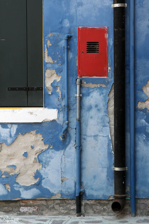
An example of a Red-Blue triadic variation is below. Do you see how the red draws your eye immediately, in the sea of blue? There is much to look at on the blue wall - pipes and peeling paint - but you see that after zooming in to the red in the blue.


Tetrad


When you combine four colors from the color wheel, either equally spaced as a square or unequally spaced as a rectangle, you have a tetrad harmony. A square tetrad incorporates two complementary pairs. Surprisingly, these color combinations are balanced and create a lot of depth in an image.


When reviewing color schemes to prepare for this post, I did not think I would have examples for this complex harmony. As I looked closer though, I found they are in my images to great effect. Consider this recent favorite from the Corvallis Farmer's market. It's a rectangular tetradic combination: Red, Violet, Green and Yellow (well, yellow-orange). No wonder it works so well! What seemed like a random jumble of color was actually a color harmony.


Here is another color combination I always thought a bit crazy, but I loved how it worked in the image. The Orange-Violet-Blue color scheme is three colors of a square tetrad. Nothing I would have noted at the time of capture, but it helps to understand why these colors work together. In the future I will be better able to see and use these complex schemes in my images.


Proportion of Color


As you get into more complex color schemes with 3 or more colors, it is important to discuss proportion of color. Typically, a pleasing color combination will have unequal amounts of each color. When working with three colors, there is the "gallon-quart-ounce" rule. In non-US language, think of it as 60-30-10. You want a "gallon" (60%) of your image to be the main color, "quart" (30%) to be the supporting color and "ounce" (10%) to be an accent color.

This colorful boat (again, from Burano) is a great example. Mainly blue, with red as a supporting color and just a pop of yellow. I couldn't have set up a better example if I had tried!


Take a look at the examples in this post with the idea of proportion in mind. Do you see the different proportions in each, and how proportion and color scheme work together with the composition of the image? Considering color along with other factors in your compositions can be a powerful tool for creating interesting images.

Summary


This week we've covered some of the more dynamic color schemes you can set up with the color wheel:
  • Complementary - Two colors, opposite on the color wheel.
  • Triadic - Three colors, equally spaced apart on the color wheel. Using only two of these three colors is a triadic variation.
  • Tetrad - Four colors, either equally spaced on the color wheel (square) or unequally but consistently spaced (rectangle).
  • Proportion - Unequal proportions of color are more pleasing to the eye. Think "gallon-quart-ounce" or 60-30-10 for the relative proportions of color in more complex color schemes.
Are you ready to try it on your own? Go through your archives and go out and look for these color schemes, see what you can find and then share it with us (link in below or share in the Flickr pool). You might even look back at what was linked in last time for Part 1, there were definitely some of these more complex color schemes found in the images shared last time. I'm looking forward to seeing what you find!


FYI - Links will be moderated. Please use a permalink, ensure that your linked image is on topic, and include a link back to this site in your post through the Exploring with a Camera button (available here) or a text link. Thanks!

*The basic color wheel image is by Eyoungsmc and is used here by creative commons license. All notations added to the color wheel image are mine.


Wednesday, September 28, 2011

From Peaceful to Dynamic

color wheel - analogous?  maybe?  :)
color wheel - analogous? maybe? by kianve

We have finished up our peaceful two weeks of color, with The Color Wheel, Part 1. The images in this post, shared by your fellow participants, are great examples of the color schemes we all studied. To me, these are beautiful and peaceful images. There is a simplicity to these colors.

Tomorrow we look at some more visually dynamic color schemes as I cover The Color Wheel, Part 2.

Things are quite busy this week, here in the Kat Eye Studio! My mom and brother are visiting from out-of-state, and work on the new website continues. The fall Find Your Eye series started class this week (love it!!) and registration for Digital Photography Basics has opened! So much good stuff, I can hardly contain my excitement to a few words in this small space. :)

So you all tomorrow, with a new Exploring with a Camera. More color awaits!

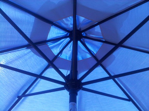
umbrella graphic
umbrella graphic by Juli JohnSt


Thursday, September 22, 2011

Share Your View: The Color Wheel, Part 1

chromatic colors in buckets
chromatic colors in buckets by Deborah T
Example of Chromatic Gradation

Color, color everywhere. Are you having fun exploring The Color Wheel? I am! There have already been so many great examples shared. There is still time to link in (below) or share your images in the Flickr pool on monochromatic, analogous and chromatic gradation. Read the original post here if you're not sure what I'm talking about, and then join in!

A quick note: Today is the last day to register for the fall Find Your Eye: Journey series of classes. The guided journey leaves this Sunday, September 25. I will leave you today with a few words from some of the lovely course participants from the Find Your Eye: Journey of Recognition course that completed last week. Their words speak so much better than mine!
"Photography has become my art form. No longer do I just shoot lots of images at events or family gatherings just because I own a camera. The "why" of taking photos is changed. I do this for me."
            -- Deborah T. Read more about Deborah's experience in her full post here.
"I’ve learned about my own photography. Through these classes I’ve been able to identify which elements of photography appeal to me. For instance, the shapes and forms of nature intrigue me. I also look for fascinating small details. As a result of the eye exercises in the class I’ve realized how important it is to look for and use light in my photographs. I've learned not to be controlled by rules and by other photographer’s opinions and photographs. I’ve learned to follow my instincts and my heart."
            -- Cathy H. Read more about Cathy's experience in her full post here.
"A loner by nature, the greatest gift of our time together was my connection with my fellow travelers. They constantly challenged me; supported me; commiserated with my frustrations; celebrated my triumphs and “ah-ha” moments. They shared their wisdom, their questions, their yearnings. I learned from their struggles, their insights, their truths. Together we dug deep; we had breakthroughs and realizations. We made each other smile. And think."
            -- Brenda. Read more about Brenda's experience in her full post here.
"I'm feeling more confident in my photography! Confident to continue to take photos that I'm familiar with... more willing to have a go at shots of things that I find harder (and even consider a bit of editing)... and being more confident to share myself through my photos... Basically, I'm inspired to keep on taking photos!"
            -- Leanne. Read more about Leanne's experience in her full post here.
Outside Hollys
Outside Hollys by Dorian Susan
Example of Monochromatic

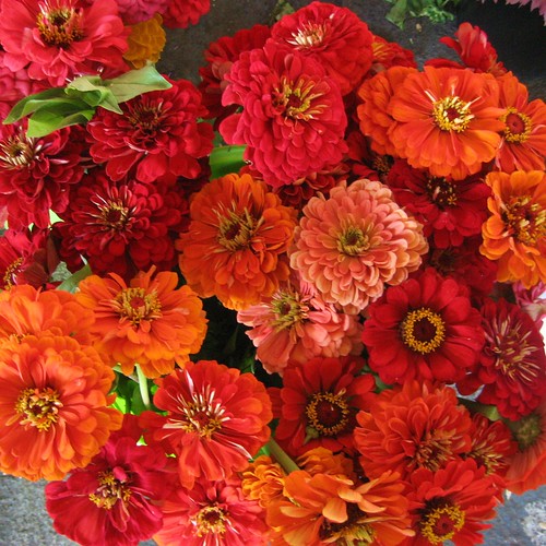
zinnias
Zinnias by gina g10
Example of Analogous


FYI - Links will be moderated. Please use a permalink, ensure that your linked image is on topic, and include a link back to this site in your post through the Exploring with a Camera button (available here) or a text link. Thanks!

Thursday, September 15, 2011

Exploring with a Camera: The Color Wheel, Part 1


**Please Note: Due to a technical difficulty the Exploring with a Camera button is no longer linking to the correct page. Please get the new button code at the bottom of this post, and replace your old button.**

I love color in photography. I love the energy and emotion you can convey through color. There is a peaceful beauty in black and white, but there is so much richness and depth in color! For the next month in Exploring with a Camera we are going to look at color. Using the color wheel as a guide, I'm going to take a look at how colors work together and how you can use that to create photographs with beauty and impact.

I was browsing a used bookstore with this topic in mind and came across the Color Workbook by Becky Koenig. What a great find! In the preface she writes:

Color is both a physical and an emotional human phenomenon. We respond to color because of its associations. We each have our personal preferences for particular color combinations. Our experience of the world is in some ways characterized by our observation of color: a green apple, a red sports car, the pink sky of a sunset, the blue of a robin's egg. These colors evoke not only an outward experience but also form colors in our memory, our inner eye. Color is not simply a decorative element in art, but a part of our inner consciousness. Color is life enhancing.
Yes! Color is life enhancing. How you see, use and portray color in your photographs is part of your eye. We may not understand why certain color combinations work to create the feel they do in our images, but there is a science and study of color that can help explain it. Let's start with the basic color wheel.*


The idea behind the color wheel is that color is a continuum. You start with the primary colors, Yellow, Red and Blue. These mix to form the secondary colors, Green, Orange and Violet (Purple). There is an intermediate color that comes from mixing a primary and secondary, noted by two letters such as "RV" for Red-Violet. These twelve colors, 3 primary, 3 secondary and 6 tertiary, form the basic color wheel. The remainder of the colors come from mixing these 12 in various ways or with neutral colors - black, white, brown. Using this as a base, we can explore the different color combinations.

Now, I don't anticipate that in our photography we are going to go around with a color wheel looking for color combinations before we take a photograph most of the time. Looking at the color wheel relative to our photographs or those of others can help us understand how and why certain color combinations works. It can help us identify what we use most often and respond to in our images. That study will inform our images at the time of capture in the future. We may be more in tune with color and how to use it the next time we go to shoot.

To start us off in Part 1 of this study today, we are a going to look at the simpler color schemes or "harmonies" as the Color Workbook calls them.

Monochromatic

The first color harmony is the simplest, monochromatic or one color. You may need to reset your definition of "monochromatic" a bit, because in photography "monochromatic" often refers to black and white or images with a single tone, like sepia. This type of image is certainly monochromatic, but let's look at monochromatic color.


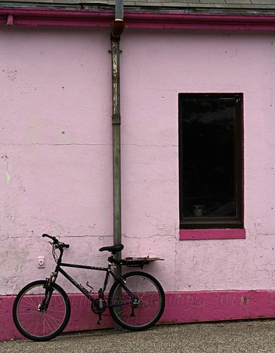
I use the monochromatic color harmony a lot. It creates a unified and cohesive image. My favorite pink shutter and wall in Burano is a good example of a monochromatic color scheme. All shades of Red-Violet, with accents that are neutral in the shutter holder and the board behind the peeling paint.


Another favorite monochromatic image is this door handle and lock from Greece. You can see in both of these images how framing a small portion of a larger scene can lead to a monochromatic image.


Framing a small portion is not the only way to get a monochromatic image, however. Another favorite from Greece shows an image that is primarily monochromatic, with the blue door, sink and gas can. There is a tiny pop of red in the faucet, but the rest is neutral and the overall color impression you have in this image is "blue."


This monochromatic image, from Burano, is green. Again, it's not all green, but the image is primarily shades of green and the remainder is neutral.


Monochromatic color schemes are great in our photographs because they can unify multiple diverse elements, as in the example of the door and the chair above. Monochromatic schemes can also help to convey a third element, like texture, as seen in the shutter and door handle. Just remember - monochromatic doesn't mean only black and white. There is so much energy and emotion to be added to an image with color!

Analogous

Moving into a slightly more complex color harmony from the color wheel, when you take two or three neighboring colors on the wheel you have an analogous color scheme. Analogous color schemes always have at least one color in common. In the diagram below, the common color is orange.


I see analogous color schemes in my images a lot, mainly in the red-orange-yellow part of the color wheel. This window in Switzerland is a great example. The grey and green serve the purpose of neutral and we see mostly the yellow and orange of the pots and window frame.


Nature is the best at creating analogous color schemes! These flowers, found in the Nice flower market, are a good example. The flowers themselves, highlighted in that beautiful light, create a lovely analogous image.


Designers use color schemes in advertising all the time to catch our eye! The analogous red-orange found in this window display is a good example. The bright, unified color along with the shiny baubles really caught my eye.


You can see how much I use the yellow-orange-red part of the wheel! That just reflects my personal color preferences. The analogous schemes you find might be in a completely different part of the wheel. Here is another analogous image, this time with blue and green. The green you see is more toward blue than yellow, which leads to a harmonious color image.


Chromatic Gradation

 Expanding to include more colors on the color wheel leads to a chromatic gradation. This is where you move through a range of several colors in sequence along the color wheel. The diagram below shows a gradation from blue to red on the wheel, encompassing violet.


These flowers from Barcelona use a chromatic gradation. From red to yellow on the color wheel, also covering oranges and pinks. It is still a unified color scheme, but a bit more dynamic than a monochromatic or analogous.


The lead-in image of the post, from the Corvallis Saturday Market, uses a progression from red to yellow as well. Another market scene, from Padua below, has a color progression from red all the way to yellow-green on the the color wheel.


Do you see how much I like the yellow-orange-red part of the color wheel? It shows up again and again in my images! I will have to look for some other examples this week to see what I can find.

The Color Wheel, Part 1 Summary

The color schemes we're looking at for this exploration are harmonious and peaceful. They are easy on the eye, because of the way they relate to the other colors on the color wheel. Just a quick recap:
  • Monochromatic - Images have one dominant color from the color wheel. You may see variations in the shades of that color, have neutrals or even small amounts of other colors, but the overall impression is of one color in the image.
  • Analogous - Images have two to three colors adjacent colors on the color wheel. There is one color in common, and the other colors used have some small amount of that color.
  • Chromatic Gradation - Images have a number of colors that can be found in sequence on the color wheel. 
For the next two weeks, take a look through your archives or keep an eye out as you photograph for these three color schemes. You can link your images below or share in the Flickr pool for a chance to be featured on the blog. Visit the links shared by your fellow participants to see more color schemes. Since we all have different color preferences, it will be interesting and fun to see how we all view the world in color! 


FYI - Links will be moderated. Please use a permalink, ensure that your linked image is on topic, and include a link back to this site in your post through the Exploring with a Camera button (available here) or a text link. Thanks!

*The basic color wheel image is by Eyoungsmc and is used here by creative commons license. All notations added to the color wheel image are mine.


kat eye view

Copy and Paste Code