Showing posts with label color. Show all posts
Wednesday, October 12, 2011
Colors don't Fade
One of the great things about photography, the colors you capture never fade. You can come back to your images again and again, and the colors remain the same. In the depths of winter, when life can seem monochromatic, this is a joy. Bright color is always to be found in my photo archives!
I hope you've enjoyed studying color for the last month, with the Exploring with a Camera themes of The Color Wheel, Part 1 and Part 2. From monochromatic to triadic, you all found some great color! We finish up Part 2 today, with a bit of fall complementary color I found on the Oregon Coast this weekend.
Since I'm in Chicago this week, there will be no new Exploring with a Camera tomorrow. I have a great one brewing to share with you next week, when I am back home. In the meantime enjoy some dynamic color as you visit the links shared in Part 2.
Thursday, October 6, 2011
Share Your View: The Color Wheel, Part 2
On the Line {1/365} by Dorian Susan
Color, color and more color! We continue with The Color Wheel, Part 2 this week. Today's images are a couple of triadic color scheme images shared in the Flickr pool. Isn't it fun to see these "found" color combinations?
You still have lots of time to share your view! You can link in below or share in the Flickr pool. An easy way to participate is to go through your archive, and see what color combinations you find. I believe you learn as much from a good archive review as you do from going out to shoot new images. And, you take that learning with you on your next shoot!
And a side note, today is my 700th post! Wow! Who would have thought, when I started my blog in 2008, that it would lead me to the place I am today. I could have never guessed. Thanks for being here with me!
"Produce great pumpkins, the pies will follow later." by CindiK.
FYI - Links will be moderated. Please use a permalink, ensure that your linked image is on topic, and include a link back to this site in your post through the Exploring with a Camera button (available here) or a text link. Thanks!
- I am over at Mortal Muses today, musing on Blur. Come by and say hi!
- Registration is open for Digital Photography Basics! Class starts October 16. Visit here for the details.
- Want to know what's going on in the studio? You can subscribe to the Kat Eye News to stay up-to-date on all the activities.
Saturday, October 1, 2011
In the Interest of Color
This morning I participated in the Scott Kelby Worldwide Photowalk, through with 1117 photo walks were planned in local communities today and tomorrow. The Corvallis photo walk was organized by one of my local photography friends, Jones Oliver. It was great to get out and meet other photographers! We had local folks from Corvallis and a few from other towns in Oregon, as well as my brother from out of state.
I captured this image of the purple chinese eggplant and the orange peppers specifically with our current exploration of the color wheel. It's a triadic scheme, purple, orange and green, in approximately the recommended proportions. Do you think it works?
More images of the photo walk to come later! Hope you are having a great weekend.
- The current Exploring with a Camera theme is The Color Wheel: Part 2. Check out the post and join in the exploration.
- Registration is open for Digital Photography Basics! Class starts October 16. Visit here for the details.
- Want to know what's going on in the studio? You can subscribe to the Kat Eye News to stay up-to-date on all the happenings.
Thursday, September 29, 2011
Exploring with a Camera: The Color Wheel, Part 2
It's time to explore more color! This week in The Color Wheel, Part 2, we're looking at some of the more dynamic color schemes you can create using the color wheel. When you place colors that are not directly adjacent on the color wheel together in a composition, you get a fantastic burst of contrast and energy.
To review the concept of the color wheel* and the adjacent color harmonies, visit The Color Wheel, Part 1.
Let's dive right in to these new combinations!
Complementary
When you combine colors that are directly opposite on the color wheel, you have a complementary color scheme. This includes the primary-secondary complementaries (Blue with Orange, Red with Green or Yellow with Violet) as well as the tertiary complementaries (i.e., Green-Yellow with Red-Violet). This color scheme has a lot of visual contrast, and can serve to pull your eye directly to a point in a photo by a pop of complementary color.
The lead in photo of the post, the purple and yellow painted wall I found in Hood River, Oregon last weekend, is an example of a complementary color scheme. Where does your eye go first? Mine goes to the yellow among the purple, then moves through the image to take in the other line and form. The image below, captured in colorful Burano, is another example. The complementary blue is what draws your eye, out of the expanse of orange.
To review the concept of the color wheel* and the adjacent color harmonies, visit The Color Wheel, Part 1.
Let's dive right in to these new combinations!
Complementary
When you combine colors that are directly opposite on the color wheel, you have a complementary color scheme. This includes the primary-secondary complementaries (Blue with Orange, Red with Green or Yellow with Violet) as well as the tertiary complementaries (i.e., Green-Yellow with Red-Violet). This color scheme has a lot of visual contrast, and can serve to pull your eye directly to a point in a photo by a pop of complementary color.
The lead in photo of the post, the purple and yellow painted wall I found in Hood River, Oregon last weekend, is an example of a complementary color scheme. Where does your eye go first? Mine goes to the yellow among the purple, then moves through the image to take in the other line and form. The image below, captured in colorful Burano, is another example. The complementary blue is what draws your eye, out of the expanse of orange.
Here's an opposite... the orange flowers draw your eye immediately in the mostly blue image. Again, this is from Burano, Italy, one of my favorite places to capture color. The people who live here know and use color to great effect! It makes me wonder if they have a class on it in school, or if it's just lore learn over time in their local culture.
The chromatic contrast from the opposites on the color wheel is one of the easiest ways to give your images a "pop" with color.
Triadic
You can create a color harmony with three colors equally spaced along the color wheel. This is called a triadic color scheme. The most typical would be the primary colors, Red-Yellow-Blue. Often seen is also Green-Orange-Violet (especially around Halloween, in the US). There are two tertiary color triads as well. These equally spaced colors on the wheel can create a wonderful balance.
Again in Burano, this primary triadic color scheme was found. The primary colors play nicely together, the image has both energy and balance.
Another primary triadic image is found in these boats in the marina of Rio Maggiore, Cinque Terre. The jumble of nautical equipment is harmonized by the primary color scheme.
Triadic Variation
When you use two of the three colors from a triad, you have a triadic variation. Think Red-Blue from the primary triad, or Green-Orange from the secondary triad. This color scheme is very common and I found many examples in my images.
A particular favorite of mine is Orange-Green. Just take a look at my blog colors! I love the dynamic contrast these two colors have with each other. I gain a lot of energy from this combination.
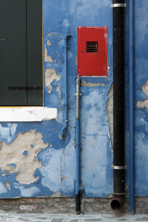
An example of a Red-Blue triadic variation is below. Do you see how the red draws your eye immediately, in the sea of blue? There is much to look at on the blue wall - pipes and peeling paint - but you see that after zooming in to the red in the blue.
Tetrad
When you combine four colors from the color wheel, either equally spaced as a square or unequally spaced as a rectangle, you have a tetrad harmony. A square tetrad incorporates two complementary pairs. Surprisingly, these color combinations are balanced and create a lot of depth in an image.
When reviewing color schemes to prepare for this post, I did not think I would have examples for this complex harmony. As I looked closer though, I found they are in my images to great effect. Consider this recent favorite from the Corvallis Farmer's market. It's a rectangular tetradic combination: Red, Violet, Green and Yellow (well, yellow-orange). No wonder it works so well! What seemed like a random jumble of color was actually a color harmony.
Here is another color combination I always thought a bit crazy, but I loved how it worked in the image. The Orange-Violet-Blue color scheme is three colors of a square tetrad. Nothing I would have noted at the time of capture, but it helps to understand why these colors work together. In the future I will be better able to see and use these complex schemes in my images.
Proportion of Color
As you get into more complex color schemes with 3 or more colors, it is important to discuss proportion of color. Typically, a pleasing color combination will have unequal amounts of each color. When working with three colors, there is the "gallon-quart-ounce" rule. In non-US language, think of it as 60-30-10. You want a "gallon" (60%) of your image to be the main color, "quart" (30%) to be the supporting color and "ounce" (10%) to be an accent color.
This colorful boat (again, from Burano) is a great example. Mainly blue, with red as a supporting color and just a pop of yellow. I couldn't have set up a better example if I had tried!
Take a look at the examples in this post with the idea of proportion in mind. Do you see the different proportions in each, and how proportion and color scheme work together with the composition of the image? Considering color along with other factors in your compositions can be a powerful tool for creating interesting images.
Summary
This week we've covered some of the more dynamic color schemes you can set up with the color wheel:
- Complementary - Two colors, opposite on the color wheel.
- Triadic - Three colors, equally spaced apart on the color wheel. Using only two of these three colors is a triadic variation.
- Tetrad - Four colors, either equally spaced on the color wheel (square) or unequally but consistently spaced (rectangle).
- Proportion - Unequal proportions of color are more pleasing to the eye. Think "gallon-quart-ounce" or 60-30-10 for the relative proportions of color in more complex color schemes.
Are you ready to try it on your own? Go through your archives and go out and look for these color schemes, see what you can find and then share it with us (link in below or share in the Flickr pool). You might even look back at what was linked in last time for Part 1, there were definitely some of these more complex color schemes found in the images shared last time. I'm looking forward to seeing what you find!
*The basic color wheel image is by Eyoungsmc and is used here by creative commons license. All notations added to the color wheel image are mine.
Labels:
color,
color wheel,
exploring with a camera,
Hood River,
Oregon
Tuesday, September 20, 2011
A Postal Mystery
Here we have a row of one of my recent fascinations, newspaper boxes. Some empty and abandoned, others and in use. All in a neat row outside of our town's post office. I loved the light coming along the wall, pointing to the row of these colorful boxes.
An appropriate photo to go along with the news of today's postal mystery. Let me set the stage...
The Liberate your Art postcard swap had just finished up, and I was contacted by my online friend Elizabeth, from Puerto Rico.
"Kat, I never received any postcards. Did you get mine?"
"I've sent out everything I received! I don't remember if I got yours or not. If you didn't get anything, I probably didn't receive your cards. I'm so sorry!"
An unsatisfying ending. Until...
Yesterday. The postcards she sent to me in July for the swap arrived in the mail yesterday. Over two months after she had sent them.
So I have 5 cheerful postcards that Elizabeth liberated into the world two months ago, now looking for a home! I would like to get some postcards back to Elizabeth too, so if you would like to send Elizabeth one of your postcards, I will send you one of hers. You don't have to have been a participant in the Liberate your Art postcard swap to do this. Email me kat [at] kateyestudio [dot] com with your interest and I will send you the details. The first five to respond are in!
One last participant. A postal mystery that will never be resolved. All I need is a few generous readers to help make Elizabeth's swap happen! Can you help?
- The current Exploring with a Camera theme is The Color Wheel: Part 1. Check out the post and join in the exploration.
- Are you ready to find your own unique vision through photography? This is the last week to register for the fall series of the Find Your Eye e-course. Class starts Sunday, September 25! Visit here for more info.
- You can subscribe to the Kat Eye News to stay up-to-date on all the happenings around here.
Thursday, September 15, 2011
Exploring with a Camera: The Color Wheel, Part 1
**Please Note: Due to a technical difficulty the Exploring with a Camera button is no longer linking to the correct page. Please get the new button code at the bottom of this post, and replace your old button.**
I love color in photography. I love the energy and emotion you can convey through color. There is a peaceful beauty in black and white, but there is so much richness and depth in color! For the next month in Exploring with a Camera we are going to look at color. Using the color wheel as a guide, I'm going to take a look at how colors work together and how you can use that to create photographs with beauty and impact.
I was browsing a used bookstore with this topic in mind and came across the Color Workbook by Becky Koenig. What a great find!
Yes! Color is life enhancing. How you see, use and portray color in your photographs is part of your eye. We may not understand why certain color combinations work to create the feel they do in our images, but there is a science and study of color that can help explain it. Let's start with the basic color wheel.*
Color is both a physical and an emotional human phenomenon. We respond to color because of its associations. We each have our personal preferences for particular color combinations. Our experience of the world is in some ways characterized by our observation of color: a green apple, a red sports car, the pink sky of a sunset, the blue of a robin's egg. These colors evoke not only an outward experience but also form colors in our memory, our inner eye. Color is not simply a decorative element in art, but a part of our inner consciousness. Color is life enhancing.
The idea behind the color wheel is that color is a continuum. You start with the primary colors, Yellow, Red and Blue. These mix to form the secondary colors, Green, Orange and Violet (Purple). There is an intermediate color that comes from mixing a primary and secondary, noted by two letters such as "RV" for Red-Violet. These twelve colors, 3 primary, 3 secondary and 6 tertiary, form the basic color wheel. The remainder of the colors come from mixing these 12 in various ways or with neutral colors - black, white, brown. Using this as a base, we can explore the different color combinations.
Now, I don't anticipate that in our photography we are going to go around with a color wheel looking for color combinations before we take a photograph most of the time. Looking at the color wheel relative to our photographs or those of others can help us understand how and why certain color combinations works. It can help us identify what we use most often and respond to in our images. That study will inform our images at the time of capture in the future. We may be more in tune with color and how to use it the next time we go to shoot.
To start us off in Part 1 of this study today, we are a going to look at the simpler color schemes or "harmonies" as the Color Workbook calls them.
Monochromatic
The first color harmony is the simplest, monochromatic or one color. You may need to reset your definition of "monochromatic" a bit, because in photography "monochromatic" often refers to black and white or images with a single tone, like sepia. This type of image is certainly monochromatic, but let's look at monochromatic color.
I use the monochromatic color harmony a lot. It creates a unified and cohesive image. My favorite pink shutter and wall in Burano is a good example of a monochromatic color scheme. All shades of Red-Violet, with accents that are neutral in the shutter holder and the board behind the peeling paint.
Another favorite monochromatic image is this door handle and lock from Greece. You can see in both of these images how framing a small portion of a larger scene can lead to a monochromatic image.
Framing a small portion is not the only way to get a monochromatic image, however. Another favorite from Greece shows an image that is primarily monochromatic, with the blue door, sink and gas can. There is a tiny pop of red in the faucet, but the rest is neutral and the overall color impression you have in this image is "blue."
This monochromatic image, from Burano, is green. Again, it's not all green, but the image is primarily shades of green and the remainder is neutral.
Monochromatic color schemes are great in our photographs because they can unify multiple diverse elements, as in the example of the door and the chair above. Monochromatic schemes can also help to convey a third element, like texture, as seen in the shutter and door handle. Just remember - monochromatic doesn't mean only black and white. There is so much energy and emotion to be added to an image with color!
Analogous
Moving into a slightly more complex color harmony from the color wheel, when you take two or three neighboring colors on the wheel you have an analogous color scheme. Analogous color schemes always have at least one color in common. In the diagram below, the common color is orange.
I see analogous color schemes in my images a lot, mainly in the red-orange-yellow part of the color wheel. This window in Switzerland is a great example. The grey and green serve the purpose of neutral and we see mostly the yellow and orange of the pots and window frame.
Nature is the best at creating analogous color schemes! These flowers, found in the Nice flower market, are a good example. The flowers themselves, highlighted in that beautiful light, create a lovely analogous image.
Designers use color schemes in advertising all the time to catch our eye! The analogous red-orange found in this window display is a good example. The bright, unified color along with the shiny baubles really caught my eye.
You can see how much I use the yellow-orange-red part of the wheel! That just reflects my personal color preferences. The analogous schemes you find might be in a completely different part of the wheel. Here is another analogous image, this time with blue and green. The green you see is more toward blue than yellow, which leads to a harmonious color image.
Chromatic Gradation
Expanding to include more colors on the color wheel leads to a chromatic gradation. This is where you move through a range of several colors in sequence along the color wheel. The diagram below shows a gradation from blue to red on the wheel, encompassing violet.
These flowers from Barcelona use a chromatic gradation. From red to yellow on the color wheel, also covering oranges and pinks. It is still a unified color scheme, but a bit more dynamic than a monochromatic or analogous.
The lead-in image of the post, from the Corvallis Saturday Market, uses a progression from red to yellow as well. Another market scene, from Padua below, has a color progression from red all the way to yellow-green on the the color wheel.
Do you see how much I like the yellow-orange-red part of the color wheel? It shows up again and again in my images! I will have to look for some other examples this week to see what I can find.
The Color Wheel, Part 1 Summary
The color schemes we're looking at for this exploration are harmonious and peaceful. They are easy on the eye, because of the way they relate to the other colors on the color wheel. Just a quick recap:
- Monochromatic - Images have one dominant color from the color wheel. You may see variations in the shades of that color, have neutrals or even small amounts of other colors, but the overall impression is of one color in the image.
- Analogous - Images have two to three colors adjacent colors on the color wheel. There is one color in common, and the other colors used have some small amount of that color.
- Chromatic Gradation - Images have a number of colors that can be found in sequence on the color wheel.
For the next two weeks, take a look through your archives or keep an eye out as you photograph for these three color schemes. You can link your images below or share in the Flickr pool for a chance to be featured on the blog. Visit the links shared by your fellow participants to see more color schemes. Since we all have different color preferences, it will be interesting and fun to see how we all view the world in color!
FYI - Links will be moderated. Please use a permalink, ensure that your linked image is on topic, and include a link back to this site in your post through the Exploring with a Camera button (available here) or a text link. Thanks!
*The basic color wheel image is by Eyoungsmc and is used here by creative commons license. All notations added to the color wheel image are mine.
Copy and Paste Code |
Labels:
color,
color wheel,
Corvallis,
exploring with a camera,
market,
Oregon
Monday, September 12, 2011
What were you made for?
- Linking in to Creative Exchange today, hosted by the lovely Lisa Gordon. Lisa's premise with the Creative Exchange is, "Your camera in one hand, your heart in the other." I love that point of view!
- The current Exploring with a Camera theme is Process of Elimination and you only have one day left to share your view! Check out the post and explore with us.
- I am musing today on Faces over on Mortal Muses. Come by and say hi!
Labels:
color,
Corvallis,
Find Your Eye,
market,
Oregon,
personal growth,
rainbow
Tuesday, August 30, 2011
Finding Color and Space
From scooter love yesterday to Burano love today. I am sharing "color" today, in honor of the wonderful Rachael Taylor who has featured me on her blog. Rachael is a surface pattern designer I met at the Do What You Love Retreat in May. Her work is beautiful and simple, and she loves bright colors, just like me. Stop by and visit her blog here to see me featured, and stick around to see her work. You will find something you love, I guarantee it. My favorite is this orange bag, which I brought home with me from the retreat. I'm so excited that it arrived with my goods from Italy, and I can start using it again. Orange Power!
I'm celebrating negative space on Mortal Muses today, so thought I would share some "space" here too. Have you stopped by and visited Mortal Muses lately? There's been a lot of change! We celebrated our first year at the beginning of August and now have five lovely new muses bringing their beautiful images and words your way. I have always loved how having nine different people working together creates a place of such beauty and diversity, and that has not changed. I hope you will join us there.
PS - Don't miss the giveaway on yesterday's post, there is still time to enter.
Labels:
Burano,
color,
flowers,
Italy,
negative space,
orange,
Rachael Taylor,
window
Wednesday, August 24, 2011
A New Day, A New Outlook
A new day has dawned, and my outlook has changed from fearful to ready to take on the world. Thank you all for the support and encouragement provided on yesterday's post! It's good to know that I am not alone, when those attacks of fear come along. So much wisdom and encouragement was shared yesterday, and I know it was meant for more than just me. The comments were filled with messages that we can all take to heart.
Here are just a few:
Diana said... I agree that fearlessness has to keep being relearned. (for me, too) Taking small steps takes energy and letting fear take over halts any progress forward.
Today though, a break from crab pots! Even I, with my current love for them, can't do three days in a row. I also found inspiration in this view of a fishing boat in Newport, capturing the reflected light, color and lines of the nautical world. While the paint was fresh and clean, the boat couldn't hide the evidence of the effects of the sea. Textures abound. That's my eye!
Do you know your eye? Find Your Eye registration is now open for the September-October series, if you want to find out. I think opening registration today has influenced my outlook for the better as well - I'm so excited to do this again! I am having so much fun with the current series going on right now.
Learning for today: Excitement and fun are great ways to overcome fear too.
Labels:
blue,
boat,
color,
Find Your Eye,
Newport,
orange,
Oregon,
reflection
Tuesday, August 23, 2011
Afraid... We Fade
When did we, when did we get so careful?
When did we, when did we lose ourselves?
Afraid... we fade.
We fade out.
-- Matt Nathanson in his song "Love Comes Tumbling Down"
This quote is from the bridge in my favorite song off Matt Nathanson's new album, Modern Love
. These words have just stuck with me... "Afraid... we fade."
So true, isn't it? When we are afraid of something, we shrink back. Hide. We stick to the tried and true, which over time becomes the boring and predictable. And we slowly, bit by bit, disappear.
As I've worked through some of my feelings around moving back to Oregon, photography, creative inspiration and blogging, I've realized I've been afraid. Afraid I wouldn't find photographic inspiration. Afraid I would lose my stream of creative ideas. Afraid I wouldn't have anything interesting to write or show. Afraid I would lose my blog readers.
So today as I debated on whether or not to post another crab pot photo, as I heard in my head, "Who would want to see another photo of crab pots," this song reminded me to just get over my silly fears and get on with it. Do what I love, write and share what interests me, as I always have. When did I get so careful? Why is this so hard? I seem to have to re-learn this concept over and over again.
"Afraid... we fade. We fade out."
So true, isn't it? When we are afraid of something, we shrink back. Hide. We stick to the tried and true, which over time becomes the boring and predictable. And we slowly, bit by bit, disappear.
As I've worked through some of my feelings around moving back to Oregon, photography, creative inspiration and blogging, I've realized I've been afraid. Afraid I wouldn't find photographic inspiration. Afraid I would lose my stream of creative ideas. Afraid I wouldn't have anything interesting to write or show. Afraid I would lose my blog readers.
So today as I debated on whether or not to post another crab pot photo, as I heard in my head, "Who would want to see another photo of crab pots," this song reminded me to just get over my silly fears and get on with it. Do what I love, write and share what interests me, as I always have. When did I get so careful? Why is this so hard? I seem to have to re-learn this concept over and over again.
"Afraid... we fade. We fade out."
Monday, August 22, 2011
Deeper than the Eye
The heart sees deeper than the eye.
- Found on my Yogi tea bag Friday
Inspiration... sometimes elusive, other times abundant. As a creative person, I'm always aware of my sources of inspiration. It comes from the reading I do, the playing in my craft. It comes from exploring the world around me. Inspiration is everywhere.
Let me repeat: Inspiration is everywhere.
This weekend, inspiration was found in crab pots sitting along the bayfront in the coastal town of Newport, Oregon. Aren't the colors and textures just amazing? I spent quite a while exploring the crab pots with my camera. A few years ago I took one picture of a stack of pots in this town, and for some reason that image popped into my head before my excursion. I was on the hunt for crab pots.
During my hunt I found a number of other things... some interesting texture, brought on by the salt water and proximity of the ocean. I found interesting colors, from the quaint buildings to the stacks of containers in the fish processing warehouses. I found interesting contrasts, in the people working in the processing plants in their rubber boots and the tourists in their flip flops. I found inspiration in the process of taking pictures, with three new Exploring with a Camera ideas coming to me. Thank goodness for my little notebook and pen, always with me in my camera bag.
Most of all, I found a deeper truth, finally understood with my heart instead of just my head. My inspiration comes from the process of creating my art. It is found when I am out and about, hunting for photos. Seeing the world through my viewfinder and lens. Translating something that just catches me out of the corner of my eye into something that is beautifully presented. It is the process of photography -- of exploring, capturing and then making those little tweaks in post-processing to perfect an image -- that matters to me. It is the process of creating that is the whole point to all of this artistic stuff. Sitting at home, inspiration doesn't come for me. It takes getting out and doing.
For some reason, a year ago or more, I had this idea that I would move back to Oregon and still share mostly photos of Europe on my blog. I have gazillions of photos from my two years of living in Italy on my hard drive - many unedited and just crying out for review. Who knows, I might even have ones I like better than my favorites hidden in the folders. So I've had this idea stuck in my head, that's what I would do... Edit my photos from the last two years and continue share them here. For some reason, I thought it was Italy and Europe that was inspiring me photographically, and that just the sharing of the images would be inspiration enough to carry me a good long while.
Not true. I know now: It's the creative process itself that inspires me. What living temporarily in Italy did was get me out regularly with my camera, to new places. It exposed me to new and different things. It got me out and doing. It got me writing and sharing. Trying new things, like painting. Once I was doing all of that, the rest took care of itself.
Inspiration is everywhere I go, because it's found within me.
That lesson, learned with my heart this weekend, may be the most important one I've learned to date. I hope you can take it to heart too.
Linking in to Creative Exchange and Creative Every Day today.
Labels:
color,
green,
inspiration,
Newport,
orange,
Oregon,
personal growth,
texture
Monday, August 15, 2011
When a Plan Comes Together
![]() |
| Cheerful flowers and colorful paint make me smile! Carbondale, Colorado |
Last week everything was finalized and agreed, and as of today I will be working at my "day job" Monday through Friday ~11am to 5pm-ish. I am so excited. I have been working toward this change for a very long time.
For those of you who may be new around here, I fell in love with having my mornings as my personal time while in Italy. My work schedule was afternoons and evenings, due to the need to work with both the Italian and US folks on a daily basis, which left my personal time as the mornings. Some time ago, as part of a series called Lessons from Abroad, I wrote about how changing my schedule this way led to some great realizations for my creativity. Mornings are my creative time.
When I finalized my schedule and transition date with my new manager last week, I realized how long in coming this transition really was. It was almost a year ago, last October, when I first started talking to my former manager about going part time on my return to the US. It was before that, while writing the Lessons from Abroad series for Jenny Shih's newsletter and blog, that I identified the schedule change and aligning to my creative energy cycle as a key factor in my personal transformation. And it was part of writing the specific article, Change up Your Schedule, that I really started to think about how I could maintain my "mornings free" schedule upon my return.
So, over the last year I've been having periodic conversations with my husband, my management at work, and myself about how this could work. I've played with different schedule ideas, "trying them on" in my imagination to see what would fit for me personally and at work. The Monday-Friday/11-5 schedule is the one I settled on recently, and when I proposed it last week it was a win-win for everyone. My new manager likes that I will be there every day instead of taking a day off; I like that I have 5 more mornings a week for myself. Can't beat that.
This is a great example of how long it can sometimes take an idea to come to fruition. The idea of part time/ mornings free was a seed planted a year ago. Nurtured, the seed grew into a plan that I took small steps on over time. It is a good reminder that if you stick with an idea, turn it into a plan and take baby steps toward it along the way, you can make it work. Things may not happen immediately, but with action, things do happen. Without action, it's just daydreaming. Yes, I was nervous when I first started talking about part time at work. Yes, I was nervous to have the conversation on my schedule last week. But all of my groundwork and planning and patience paid off, and here I am this Monday morning, free.
What will I create today?
Labels:
blue,
Carbondale,
color,
Colorado,
creative,
flowers,
Lessons from Abroad,
repatriation,
schedule
Friday, August 12, 2011
The Reality of the Situation
![]() |
| A group of colorful bike racks in a Carbondale, Colorado city parking lot. |
Here are a few things I've noticed this week:
Travel. For the first time in two and a half years, I don't have a vacation coming up in the next couple of months. No visits to new countries on the horizon, no next trip in the works. Just a stretch of several months with no vacation time left at work and no firm plans yet for future travel. It is odd. I found myself hurrying at work to get something done before I left for... nowhere. I'm not sure what I was thinking. I've gotten used to working to that next deadline of time off. Even moving back, I had three weeks here and then we left again to visit Colorado. It's not bad, it's just different and something I need to get used to. This reminds me I need to get some plans on the calendar, if only for some weekend excursions. I love to travel too much!
Transport. We are down to one vehicle, living in a place where we've always had two. When we moved to Italy, we sold our car and had a friend keep our truck. We had always planned on buying another car when we returned, but several months ago I started wondering if we needed to. We had been living in Italy with one car, I could ride my bike to work (I used to commute by bike all the time), and our town is small enough to easily get around. Between bike, bus and scooter I figured we could get by. After returning home from Italy, we had a rental car for several weeks, which was returned the day before we left for Colorado. This week is the first week we are truly living with one vehicle. It's a different feeling to bike to work because I have to rather than because I want to. It's different to ask if a friend can drive because I don't have a car. Not bad, just a little uncomfortable at the moment. Not to mention that I have discovered that my body is not in the best shape to go from riding zero miles to 60 miles (6 mile commute each way) in a week. I couldn't quite make it through the week, I caught a ride on Wednesday to give my legs a break.
Finances. We've gone from a completely unique financial mindset in Italy (two years = no regrets), to a temporary mindset moving home (get our lives set up ASAP), to me starting a part time schedule next week. Back to reality, and getting ourselves on a long-term budget once again. We didn't go hog-wild while on our assignment, but the "no regrets" mentality did change our handling of money. That can't stay in place forever without serious consequences. I tend toward being financially conservative so my budget-minded, practical side keeps me in line, but my impulsive, emotional side is feeling the tension of restraint. Working part time is nothing new and living on a budget is nothing new... It's just like the bike though, we're out of shape and it's a little uncomfortable at the moment.
So there you have it in a nutsell: Reality has set in. When first moving back, it was all about the physical changes that come with location. Now I'm feeling real changes that make me internally uncomfortable. I know I'll get used to this new reality, but that doesn't eliminate the discomfort of changing habits. It only makes it manageable.
Monday, June 20, 2011
Orange Power
Imagine my joy: On Saturday, while wandering the streets of Milan for a last time, I found another image for my market/wheels series. And not only that, but the scooter is my "power color" - Orange! What luck! I find orange to be an energetic color, full of life. For some reason, when I use the color orange, in my art, on my blog or in my clothes, it gives me courage. Courage to be different, to stand out, to be myself. Courage to share the "Kat Eye View." This discovery has sort of happened organically over the last year, and now I love anything orange. So I couldn't help but enjoy this scene immensely. Thank you, Italy, for another wonderful gift.
How about you? Do you have a power color? How did it come about? I would love to hear your story too!
Saturday, May 21, 2011
All Locked Up + Swap Update
I am in love with locks lately. I seem to have quite a few from our visit to Greece a few weeks ago. But, seriously, who could resist this color and shape? And those little embossed dots? The square bolts? Could you have resisted?
I'm considering this as one of the images in my next postcard order. We are so, so close to my goal -- 195 people are currently signed up for the Liberate Your Art postcard swap! Isn't that awesome? If we hit my goal 200, I promised that everyone signed up with get a postcard from me in addition to 5 postcards they will receive from other participants. I'm so excited to be this close to the goal, and it's time for me to think about my postcards too! Especially since I liberated most of my current stock at the Do What You Love retreat last week. Postcards were a great way to give people something a little bit "more" of my art than a business card. Everyone seemed to really like looking through them and choosing their favorite too.
There is still time to help me get the word out or to sign up for the swap yourself! I'm going to close sign up on Saturday, 4 June, so that I can be sure that everyone gets the final details I send to the list in June. Go here for the rest of the details, to get a button for your blog or to sign up.
I've added tons of new links to the participant link list this week. That means it's time to go visiting again. Can you find the artist who paints on rocks? How about an artist who lives in Australia? They are in there, and so, so many more amazing artists. Pick two or three links, go and visit, and leave a note letting them know you stopped by from the postcard swap!
Here are the new links added this week:
Saturday, May 7, 2011
Learning Traditions of other Cultures
We were in Greece on Easter Sunday so we had the opportunity to learn some of the local traditions for celebrating Easter. A red egg, a symbol of renewal, is served to each person at breakfast. Isn't that a gorgeous red? I loved the primary color combination at our breakfast table that morning. Brandon loves the yolks of hard boiled eggs, so he ate all three of them.
The other Easter tradition we learned about is the large gatherings of family and friends on Sunday afternoon, where a whole lamb is roasted over an open pit fire. It was an interesting sight, these whole lambs rotating over a bed of coals. Nothing I particularly cared to photograph though! Patrick loves lamb so he enjoyed having a platter of freshly roasted meat at both lunch and dinner. I'm not fond of lamb, so I stuck to other options like a yummy Greek Salad.
Learning about the traditions of other places is one of the fun things about traveling and living abroad. You learn that there are more ways of celebrating, believing or even day-to-day living than you could ever imagine from the point of view of your home culture. I don't think you ever stop being surprised, but you become more open and accepting of just about anything.
I think our world would be a more accepting and friendly place, if we all just travelled more. Do you agree?
Subscribe to:
Posts (Atom)