


It's time to explore more color! This week in The Color Wheel, Part 2, we're looking at some of the more dynamic color schemes you can create using the color wheel. When you place colors that are not directly adjacent on the color wheel together in a composition, you get a fantastic burst of contrast and energy.
To review the concept of the color wheel* and the adjacent color harmonies, visit The Color Wheel, Part 1.
Let's dive right in to these new combinations!
Complementary
When you combine colors that are directly opposite on the color wheel, you have a complementary color scheme. This includes the primary-secondary complementaries (Blue with Orange, Red with Green or Yellow with Violet) as well as the tertiary complementaries (i.e., Green-Yellow with Red-Violet). This color scheme has a lot of visual contrast, and can serve to pull your eye directly to a point in a photo by a pop of complementary color.

The lead in photo of the post, the purple and yellow painted wall I found in Hood River, Oregon last weekend, is an example of a complementary color scheme. Where does your eye go first? Mine goes to the yellow among the purple, then moves through the image to take in the other line and form. The image below, captured in colorful Burano, is another example. The complementary blue is what draws your eye, out of the expanse of orange.

To review the concept of the color wheel* and the adjacent color harmonies, visit The Color Wheel, Part 1.
Let's dive right in to these new combinations!
Complementary
When you combine colors that are directly opposite on the color wheel, you have a complementary color scheme. This includes the primary-secondary complementaries (Blue with Orange, Red with Green or Yellow with Violet) as well as the tertiary complementaries (i.e., Green-Yellow with Red-Violet). This color scheme has a lot of visual contrast, and can serve to pull your eye directly to a point in a photo by a pop of complementary color.

The lead in photo of the post, the purple and yellow painted wall I found in Hood River, Oregon last weekend, is an example of a complementary color scheme. Where does your eye go first? Mine goes to the yellow among the purple, then moves through the image to take in the other line and form. The image below, captured in colorful Burano, is another example. The complementary blue is what draws your eye, out of the expanse of orange.

Here's an opposite... the orange flowers draw your eye immediately in the mostly blue image. Again, this is from Burano, Italy, one of my favorite places to capture color. The people who live here know and use color to great effect! It makes me wonder if they have a class on it in school, or if it's just lore learn over time in their local culture.

The chromatic contrast from the opposites on the color wheel is one of the easiest ways to give your images a "pop" with color.
Triadic
You can create a color harmony with three colors equally spaced along the color wheel. This is called a triadic color scheme. The most typical would be the primary colors, Red-Yellow-Blue. Often seen is also Green-Orange-Violet (especially around Halloween, in the US). There are two tertiary color triads as well. These equally spaced colors on the wheel can create a wonderful balance.

Again in Burano, this primary triadic color scheme was found. The primary colors play nicely together, the image has both energy and balance.

Another primary triadic image is found in these boats in the marina of Rio Maggiore, Cinque Terre. The jumble of nautical equipment is harmonized by the primary color scheme.

Triadic Variation
When you use two of the three colors from a triad, you have a triadic variation. Think Red-Blue from the primary triad, or Green-Orange from the secondary triad. This color scheme is very common and I found many examples in my images.

A particular favorite of mine is Orange-Green. Just take a look at my blog colors! I love the dynamic contrast these two colors have with each other. I gain a lot of energy from this combination.

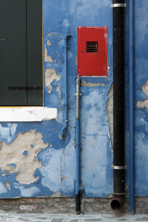
An example of a Red-Blue triadic variation is below. Do you see how the red draws your eye immediately, in the sea of blue? There is much to look at on the blue wall - pipes and peeling paint - but you see that after zooming in to the red in the blue.
Tetrad
When you combine four colors from the color wheel, either equally spaced as a square or unequally spaced as a rectangle, you have a tetrad harmony. A square tetrad incorporates two complementary pairs. Surprisingly, these color combinations are balanced and create a lot of depth in an image.

When reviewing color schemes to prepare for this post, I did not think I would have examples for this complex harmony. As I looked closer though, I found they are in my images to great effect. Consider this recent favorite from the Corvallis Farmer's market. It's a rectangular tetradic combination: Red, Violet, Green and Yellow (well, yellow-orange). No wonder it works so well! What seemed like a random jumble of color was actually a color harmony.

Here is another color combination I always thought a bit crazy, but I loved how it worked in the image. The Orange-Violet-Blue color scheme is three colors of a square tetrad. Nothing I would have noted at the time of capture, but it helps to understand why these colors work together. In the future I will be better able to see and use these complex schemes in my images.

Proportion of Color
As you get into more complex color schemes with 3 or more colors, it is important to discuss proportion of color. Typically, a pleasing color combination will have unequal amounts of each color. When working with three colors, there is the "gallon-quart-ounce" rule. In non-US language, think of it as 60-30-10. You want a "gallon" (60%) of your image to be the main color, "quart" (30%) to be the supporting color and "ounce" (10%) to be an accent color.
This colorful boat (again, from Burano) is a great example. Mainly blue, with red as a supporting color and just a pop of yellow. I couldn't have set up a better example if I had tried!

Take a look at the examples in this post with the idea of proportion in mind. Do you see the different proportions in each, and how proportion and color scheme work together with the composition of the image? Considering color along with other factors in your compositions can be a powerful tool for creating interesting images.
Summary
This week we've covered some of the more dynamic color schemes you can set up with the color wheel:
- Complementary - Two colors, opposite on the color wheel.
- Triadic - Three colors, equally spaced apart on the color wheel. Using only two of these three colors is a triadic variation.
- Tetrad - Four colors, either equally spaced on the color wheel (square) or unequally but consistently spaced (rectangle).
- Proportion - Unequal proportions of color are more pleasing to the eye. Think "gallon-quart-ounce" or 60-30-10 for the relative proportions of color in more complex color schemes.
Are you ready to try it on your own? Go through your archives and go out and look for these color schemes, see what you can find and then share it with us (link in below or share in the Flickr pool). You might even look back at what was linked in last time for Part 1, there were definitely some of these more complex color schemes found in the images shared last time. I'm looking forward to seeing what you find!
*The basic color wheel image is by Eyoungsmc and is used here by creative commons license. All notations added to the color wheel image are mine.


